The Exhibition:
1. The title of this exhibit was Art Craft in Media 2011.
2. The theme of this exhibit was craft models that can be made by hand i thought.
The Gallery:
1. The lighting that was used seemed to bright white light with little to no shadow that made the room look intriguing to me. The lighting was arranged evenly on the ceiling which distributed the bright white light evenly in the area of the exhibit. Although there was emphasis of the lighting coming out of a few works of art on the wall.
2. The walls in this art gallery were all white and there were no other colors to be seen.
3. The materials that were used in the interior architecture of space were a circular bench i saw in a different room. Also in the picture above it that strip in the middle is rising rust that is happening slowly and it looked like a carpet to me. I felt the need to touch it just to check.
4. The floor plan set up a pretty smooth movement, it flowed in one direction to lead you through the gallery. The viewers seemed to be moving at all times because of all the interesting works that were placed in this exhibit.
The Artwork :
1. In this art exhibit the artworks were organized in a pretty cool way. For example that rust strip that i thought was a carpet was the only piece of work that seemed to be different amongst the rest. All of the other artworks were organized in a odd but cool pattern.
2. These artworks were similar in ways because they all were crafts and they were created by hand and stood out for the meaning to be appreciated for what they are. They are also similar because they all were part of the same exhibit.
3. These artworks were different because they all were created by different types of materials and had certain values that were different from others.
4. The majority of these artworks were framed all in glass cases mainly so people could not touch them.
5. The artworks were identified and labeled on a white box next to the artwork with the name of the artwork and the artist in that white box.
6. The proximity of the artwork was spaced in different parts and was arranged in anyway that the creators wanted to do it. Some were a close walk and some were a far walk.
Art Criticism:
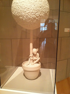
1. The first artwork that i selected was called Surrogate (monkey/topiary), 2011 by Bethany Krull. It seems that this artwork was created with porcelain and paper. I have never heard of porcelain, but it made this monkey hugging this tree have a lot more emphasis and it stood out to me more. This was the first art work that grabbed my attention because i always liked monkeys and the monkey looks so small compared to the tree so i was contemplating why this was occurring. This reminds me of a someone trying to take a nap under a tree and i really enjoyed this work of art a lot. Some art elements or principals i notice in this are shape, emphasis, and value.
2. This was the second artwork that i had chosen to write about from this art exhibit and it is called MC #10, 2010 by Jozef Bajus. I chose this artwork because when i first came across it in the museum i was confused to what it what until i read what it was made of and looked at it completely. This was made with mixed objects such as paper, tape, and a mirror found on the bottom. The mirror was the hard part to notice, but when i did i realized that it gave a cool reflection and it showed a patter of a diamond in the middle. This got my mind going for a few minuets and i enjoyed it a lot. This was very creative and i hope to see more of these in the future. Some art elements or principals i notice with this work of art is color, proportion, and balance.
3. This is my third work of art i selected from the exhibit and it is called Rooster, 2010 by Stephanie Brash. This work of art was created with wood fired ceramic. This rooster kind of looked like a trophy to me at first when i was walking by it, but when i approached it i started analyzing it more and realized it was more than just a normal rooster. The lighting that is surrounding this rooster gives it a nice shadow that i think looks like one of those baskets with a snake coming out of it. There is great detail to this and i enjoyed examining it for what it was and not just walking by it saying whatever. Some art elements or principals i notice with this work of art is texture, color, and value.
What did you think of visiting the Gallery and purposefully looking at the exhibition from a different perspective - the physical space, the architecture, theme, etc.?
Going to visit an art gallery for me is usually boring and it is just an assignment. But this one was a different experience. I got to see actual works of art that meant something to people and they really put their time and effort into it. My perspective on going to art exhibits after this one has changed because i get to see more of what's actually out there now.


No comments:
Post a Comment